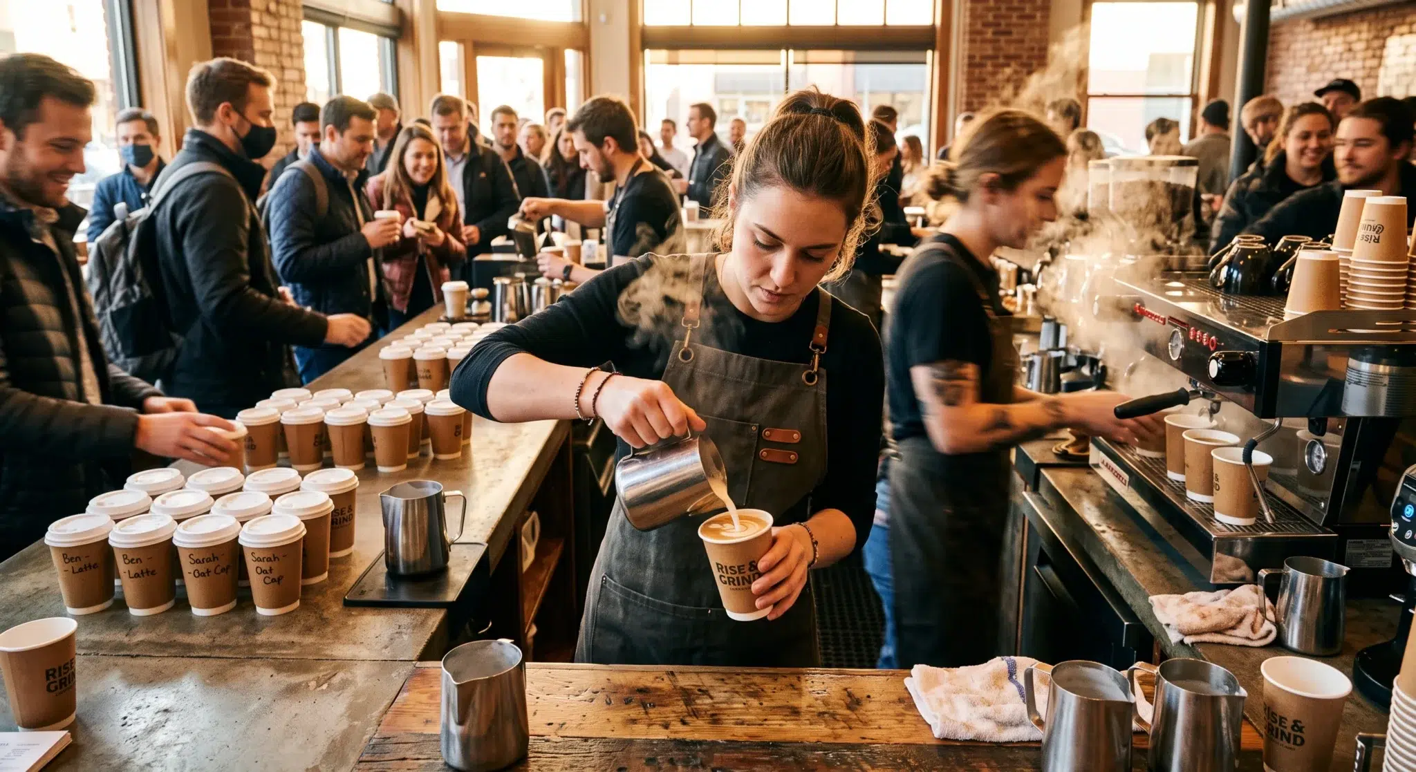

For independent café owners, the morning rush represents both the primary revenue driver and the greatest operational challenge. Between 7:00 AM and 9:00 AM, success is measured not in bean quality, but in tickets per hour. When the line of commuters stretches out the front door, every second of transaction latency compounds, leading to customer frustration, walkaways, and lost revenue. In high-volume coffee environments, the technical bottleneck is rarely the espresso machine’s recovery time; it is almost always the point-of-sale interaction interface. Baristas face cognitive overload when navigating clunky software menus, searching through endless sub-categories to find a simple modifier while simultaneously managing guest interaction.
The solution to accelerating throughput lies in sophisticated, user-experience-driven design. Optimizing your coffee shop POS screen layout is the single fastest way to cut customer wait times and maximize peak revenue without increasing labor costs. By transforming the transaction interface into an intuitive, visually responsive hotkey grid, you turn raw transaction data entry into rapid muscle memory. When baristas only need two taps to ring up an iced oat vanilla latte and accept contactless payment, the entire operation shifts from chaotic damage control to efficient profit generation. This guide provides actionable visual UI blueprints to refine your café’s register flow, achieve the “3-second transaction,” and boost staff efficiency during peak volume.
Table of Contents
- The Legacy Menu Bottleneck: How Poor UI Slows Down the Morning Rush
- Thumb Zone Architecture: Placing Top Sellers for Natural Muscle Memory
- Minimizing Click-Depth: Establishing the 2-Tap Maximum Rule
- Chromatic Menu Organization: Visual Instinct over Reading
- Integrated Contactless Payments and Zero-Tap Receipts
- Training for Speed: Converting Navigation to Instinct
- The Role of Sales Data in Ongoing Screen Optimization
- Side-by-Side Comparison
- Achieving the 3-Second Transaction with Biyo POS Fast-Grid
- Frequently Asked Questions
The Legacy Menu Bottleneck: How Poor UI Slows Down the Morning Rush
Walk into almost any struggling coffee shop during the morning rush, and you will witness the same operational breakdown at the cash register. A customer asks for a “medium half-caf oat milk latte with vanilla and extra foam.” The barista, already exhausted, freezes for a few seconds. They then begin a frustrating digital excavation project on the touchscreen: ‘Drinks’ -> ‘Hot Drinks’ -> ‘Lattes’ -> ‘Latte’ -> ‘Size: Medium’ -> ‘Modifiers’ -> ‘Milk Options’ -> ‘Oat Milk’ -> ‘Syrups’ -> ‘Vanilla’ -> ‘Instructions’ -> ‘Extra Foam.’ The transaction clock has already ticked past ten seconds, and they have not even initiated payment. Consequently, the line behind this customer grows, and the barista’s stress levels skyrocket, increasing the likelihood of errors. Therefore, a poor coffee shop POS screen layout acts as a direct tax on your throughput.
The Cognitive Load Barrier for Baristas
A cluttered, non-intuitive interface forces baristas to use conscious cognitive processing for every single order. Instead of focusing on hospitality and active listening, they are searching for text-heavy buttons arranged in alphabetical lists. This operational drag is exacerbated by high staff turnover, which is common in the hospitality industry. New hires require extensive training just to navigate the POS system before they can even touch the espresso machine. As a result, onboarding takes longer, and the entire team’s speed during the morning queue is limited by the training curve of the newest member. Efficient café operations rely on instinct, not navigation.
The Compounding Latency Trap
In any queuing system, slight delays at the input stage compound exponentially through the line. A five-second delay in order entry might seem minor on a single ticket, but when that is multiplied across thirty customers, that is two and a half minutes added to the wait time for the customer at the back. These delays introduce friction at the handoff station as well, as handwritten slips or confusing digital printouts lead to drink remake errors. This scenario is avoided when order input is immediate and perfectly accurate, dispatching clear instructions straight to the Kitchen Display System (KDS) or expeditor printer simultaneously.
 Thumb Zone Architecture: Placing Top Sellers for Natural Muscle Memory
 Thumb Zone Architecture: Placing Top Sellers for Natural Muscle Memory
Modern mobile application design relies on the principle of the “thumb zone”—the areas of a screen easily reachable with a user’s thumb without shifting their grip. While cashiers use full POS tablets, the same principle of ergonomic reach applies. Baristas, through repetition, develop rapid muscle memory for button locations. If your interface requires them to tap the top-left corner for ‘Drip Coffee’ and the bottom-right corner for ‘Milk Option,’ they are moving their hand across the entire screen acreage unnecessarily for every transaction. Strategic optimization uses ergonomic data to place high-frequency items within the natural range of the cashier’s hand.
The High-Frequency 3×3 Grid Strategy
Sales reports almost always reveal a Pareto distribution: twenty percent of your menu items generate eighty percent of your revenue. Your primary coffee shop POS screen layout must reserve the most reachable area—typically the central and lower-right portions of the tablet screen for right-handed cashiers—for these “top 10” drinks. By creating a dedicated 3×3 or 4×4 fast-access grid containing Drip Coffee, Latte, Cappuccino, Cold Brew, and top pastries, you turn order entry into an instantaneous instinct. Baristas stop “reading” the screen and start “playing” it like a familiar instrument.
Left-to-Right Ordering Flow
Human visual processing naturally flows from left to right. Your optimized fast-access grid must replicate this standard ordering logic. Place core item selection on the left side of the screen, modifiers in the center, and transaction actions (like ‘Pay’ or ‘Send’) on the far right. Consequently, the cashier moves through the transaction sequence logically and smoothly. They select the drink, customize it with a single tap from the centrally populated modifier list, and finalize the payment in one fluid motion. This logical left-to-right flow minimizes cognitive decision points.
Minimizing Click-Depth: Establishing the 2-Tap Maximum Rule
In UI/UX design, “click-depth” refers to the number of interactions required to complete a task. In a busy morning queue, excessive click-depth is poison. Every time a barista has to tap ‘Modifiers’ to find the ‘Syrups’ folder to find ‘Vanilla,’ they are introducing decision delay and manual latency. Cafés aiming to cut customer wait times must establish a mandatory 2-tap maximum rule for ninety percent of their transactions: the core menu item, followed by one tap to customize it.
The Modifier-Pop vs. Sub-Category Drift
The traditional POS approach utilizes deep nested sub-categories, which forces the barista to drift through multiple screens. The modern, optimized approach populates the screen dynamically based on the parent item selected. Therefore, when a barista taps ‘Latte,’ the center of the screen must *immediately and automatically* populate with the top five milk options and the top five syrup flavors, right alongside the default options. The barista never “drifts” into a new folder; the modifiers “pop” instantly to them. A ‘Latte’ with ‘Oat’ is achieved in exactly two intuitive taps: ‘Latte’ -> ‘Oat’.
Default Configurations and Smart Presets
Analyzing your menu data allows you to utilize smart defaults. If eighty percent of lattes sold are whole milk, make whole milk the automatic default configuration that populates upon selecting ‘Latte.’ The barista only needs to tap a modifier if the customer specifically requests a deviation. This optimization shaves seconds off the majority of tickets. Advanced systems even support “smart presets” for popular combinations, creating a dedicated ‘Iced Oat Vanilla Latte’ hotkey that rings up the item, size, and modifications in a single tap during peak volume.
Chromatic Menu Organization: Visual Instinct over Reading
Visual processing speeds are significantly faster than text processing speeds. When cashiers are forced to read text-heavy buttons, they slow down. A monotone register screen causes “visual clutter,” making it harder to distinguish between ‘Matcha’ and ‘Macchiato’ under pressure. Coffee Shop POS screen layout optimization relies heavily on chromatic organization—using color as the primary visual trigger to differentiate categories and items instantly.
The Chromatic Color Blueprint
Establish a logical color blueprint that appeals to barista instinct:
- Hot Drinks (Warm Colors): Use varying shades of deep reds, oranges, and warm ambers for all hot espresso drinks.
- Cold Drinks (Cool Colors): Use blues, teals, and purples for iced lattes, cold brews, and frappés. This immediately stops cashiers from accidentally ringing up a hot drink when the customer said ‘iced.’
- Food & Pastries (Neutral Tones): Utilize shades of green, brown, or light grays for all bakery items.
- Transaction Actions (High Contrast): Make the final ‘PAY’ or ‘SEND’ button a bright, high-contrast color like neon green or bright blue to signify the final action. This chromatic distinction makes accidental finalizations almost impossible.
Grid Visual Clarity over List Complexity
Standard point-of-sale interfaces often default to alphabetized lists, which requires the cashier to find ‘L’ for Latte rather than visually recognizing its location. Grid layouts, supported by strong chromatic coding and minimal, clean text, provide significantly better visual clarity. Advanced systems now even support minimal custom icons for key items (like a tiny latte art graphic for espresso drinks), further accelerating visual recognition and conversion speed. Baristas stop “reading” and start “reacting” chromatically to the screen logic.
Integrated Contactless Payments and Zero-Tap Receipts
The transaction does not end when the barista finishes building the cart; the payment and receipting process is frequently the single biggest bottleneck in a coffee queue. While order entry latency is frustrating, payment latency is infuriating for both the customer and the team. Traditional setups with standalone credit card terminals require the cashier to re-type the total, wait for it to sync, ask the customer to follow prompts, wait for the receipt to print, and get a signature. Integrated payments completely eliminate these friction points.
integrated Terminal Awakening and Tap-and-Go Processing
Modern point of sale systems utilize fully integrated payment terminals. The moment the barista finishes the order entry, the payment terminal “awakens” instantly, displaying the total to the customer. There is zero human data re-entry. The cashier simply says “That will be $5.20” while the customer is already tapping their smartphone (Apple Pay/Google Pay) or contactless credit card against the terminal. When integrated properly, the terminal authorizes, processes, and closes the transaction in under one second, signaling the POS to clear the screen simultaneously.
Receipt Toggling and Zero-Tap Logic
Receipt printing causes immense latency. In a busy morning rush, eighty percent of customers decline a physical receipt. Cafés optimized for speed utilize a “zero-tap receipt” strategy:
* Default to “None”: Configure the system to automatically default to “None” or skip the receipt screen completely for orders under a specific threshold (e.g., $10).
* Cashier-Facing Toggle: The receipt choice (Print, Email, Skip) is presented to the barista, not the customer. When the payment processes, the barista simply taps ‘None’ or ‘Print’ with their final finger motion before the next customer arrives. They never turn a tablet around or ask the customer. This logic eliminates five to ten seconds of terminal decision time per ticket.
Training for Speed: Converting Navigation to Instinct
Optimizing your coffee shop POS screen layout is only effective if your team is trained to utilize its speed. Training must shift from teaching navigation ( *”Click here to find sub-categories”* ) to teaching instinct and response time ( *”This color means hot, this location means latte”* ).
A speed-optimized interface significantly reduces onboarding time, but active training is still required to convert knowledge into muscle memory.
The Role-Play Simulation Drills
Do not train new hires during a live morning rush. Instead, use quiet afternoon periods for speed-focused training drills. Have an experienced barista rattle off increasingly complex customized orders rapidly: *”Medium half-caf oat milk latte with extra foam; large black cold brew.”* The trainee’s goal is not accuracy alone, but immediate input speed. If they have to search for a button, they have failed the drill. Through repetitive simulation, they develop natural muscle memory for the key item grids.
Competitive Throughput Metrics (Barista Olympics)
Motivate your team to prioritize speed by gamifying throughput metrics. Use Sales Reports to track the “Average Transaction Duration” by cashier ID during peak morning hours. Recognizing and rewarding the cashiers with the fastest average transaction times (while maintaining accuracy) incentivizes the team to study the POS grid and master the 2-tap workflow, accelerating the morning line flow automatically.
 The Role of Sales Data in Ongoing Screen Optimization
 The Role of Sales Data in Ongoing Screen Optimization
Your optimized POS screen is not a static installation; it must evolve based on changing customer behavior and sales data. Cafés that continuously cut customer wait times perform quarterly audits of their Sales and Modifier Reports to refine their register UI logic.
A data-driven interface ensures that your most frequent transaction workflows always require the least operational effort.
Quarterly sales audits and the top 10 re-pacing
If your winter sales report shows that Peppermint Mochas have displaced Cappuccinos in your top 10 sellers, you must immediately adjust the fast-access grid. Swap the Cappuccino hotkey with the Peppermint Mocha hotkey. If the Cappuccino hotkey moves to a secondary category, ensuring that seasonal high-volume items remain on the primary fast-grid maintains optimal throughput. Neglecting this dynamic update introduces unnecessary folder drifting during peak volume.
Audit of nested modifier depth
Examine your modifier reports specifically. If the data shows that 95% of ‘Syrups’ modifications are specifically ‘Vanilla,’ but baristas have to navigate through the ‘Syrups’ folder to find it, you have identified a bottleneck. Move the ‘Vanilla’ hotkey *out* of the sub-folder and place it directly alongside the milk options that populate upon selecting ‘Latte.’ This modification saves four taps on every single vanilla latte order. Data-driven adjustment ensures your interface reflects current café reality.
Side-by-Side Comparison
| Operational Metric | Traditional / Unoptimized Café POS | Biyo Fast-Grid Optimized café POS |
|---|---|---|
| Top 10 Menu Access | Located in deep nested folders (alphabetized list) | Custom Fast-Grid (Thumb Zone 3×3 layout) |
| Click-Depth (Custom Latte) | 5+ Taps (Latte > Size > Modifiers > Milk > Oat) | 2 Taps (Latte > Oat Milk MODs) |
| Visual Logic | Text-heavy list views (forces reading) | Chromatic Coding ( Instinct over Reading) |
| Modifier trees | static folders that must be navigated manualy | dynamic context-aware mods pop instantly |
| Payment Processing | Standalone terminal (forces re-typing total) | Fully Integrated rapid tap-and-go (authorization < 1 sec) |
| Receipt Handling | Customer terminal choice (adds decision time) | Cashier skip logic with automated email defaults |
| Transaction Duration (Morning Peak) | 10–15 Seconds (data entry alone) | 3–5 Seconds (Order Input to Finalization) |
| Onboarding New Hires | 4–6 hours training on complex menu navigation | < 1 hour (Instinct-based training) |
Achieving the 3-Second Transaction with Biyo POS Fast-Grid
Biyo POS delivers a specialized cloud operating system engineered specifically to handle the demands of high-volume coffee shops, cafés, and bakeries. Running smoothly entirely in the cloud directly inside the Google Chrome browser on any PC, Mac, iPad, or Android tablet, Biyo provides independent café owners with complete control over their checkout interface without expensive proprietary hardware. Baristas can access the native online store, drive-thru ordering, and self-service kiosks from a single, unified register view.
With Biyo’s highly advanced catalog engine, you can build a customized **Fast-Grid Interface** optimized for maximum throughput. Group your parent items and context-aware modifier trees to satisfy the 2-tap maximum rule for customized drinks. Baristas never drift into nested sub-categories. For instance, when a barista rings up an ” iced oat vanilla latte,” Biyo is configured to populate context-aware milk and syrup options instantly upon selecting the parent drink.
Let’s walk through the three steps to ring up that iced oat vanilla latte:
1. First, navigate to the ‘Drinks’ section. The chromatic cool blue button will make this quick and easy. Tap that button and select the ‘Iced Latte’ Parent SKU.
2. Next, we need to add the oat milk. A dynamic pop-up menu will appear. Simply tap the ‘Oat Milk’ modifier within that menu.
3. 3. Finally, let’s finish with the vanilla syrup. You’ll find the ‘Vanilla Syrup’ modifier right there in the same pop-up menu. A quick tap completes the order!
Biyo POS then finalizes with zero human payment data entry. Biyo integrates seamlessly with fast-authorization payment terminals that “awaken” instantly, processing contactless taps (Apple Pay, Google Pay) in under one second. Furthermore, Biyo can perform rapid variant-level inventory sync using the **Biyo Inventory Scanner app on the Apple App Store**, manage associated bakery concepts with the **Biyo Kitchen Display (KDS) app on Google Play**, and maintain uninterrupted operation during internet outages with true offline transaction caching.
To discover how easily your café can achieve the 3-second transaction and maximize morning peak revenue, you can schedule a live demo with an onboarding specialist or get started today on the Biyo signup page.
Frequently Asked Questions
What is a coffee shop POS screen layout optimization?
Coffee shop POS screen layout optimization is the strategic visual design of the transaction interface, utilizing thumb-zone ergonomics, minimal click-depth, and chromatic color coding to convert complex menu navigation into rapid barista muscle memory during high-volume rushes.
How do fast-grid interfaces cut customer wait times in cafés?
Fast-grid interfaces cut customer wait times by providing immediate 1-tap access to ninety percent of top-selling menu items and populating context-aware dynamic modifier menus instantly, reducing average order input duration to under three seconds.
Why is chromatic color coding essential for coffee POS screens?
Chromatic color coding uses visual instinct over textual reading. By assigning warm colors to hot drinks and cool colors to cold drinks, baristas immediately recognize categories and select the correct items by visual reaction, significantly speeding up throughput and reducing errors under pressure.
What is the “2-tap maximum” rule for café ordering?
The 2-tap maximum rule dictates that a customized drink order (the core item + one modification) must be completed in exactly two interactions: selecting the drink, and selecting the modification from a dynamically populated menu, without navigating folders.
Can Biyo POS manage complex modifier trees and variants?
Yes. Biyo’s advanced catalog engine allows café owners to configure complex, context-aware modifier pop-ups that activate instantly when parent items are selected, ensuring barista speed and total accuracy on customized orders.
Does Biyo POS support integrated fast-authorization payments?
Yes. Biyo integrates with rapid-authorization payment terminals that activate instantly upon order completion, processing contactless taps (like Apple Pay) in under one second to eliminate terminal decisions and signature bottlenecks.