Before you even think about looking at charts and graphs, the real work of analyzing sales data begins with setting a solid foundation. You can’t just jump into the numbers and hope for the best. Meaningful insights are born from careful preparation, not happy accidents.
It all boils down to a simple, timeless truth in data: garbage in, garbage out. The quality of your analysis is completely dependent on the quality of the data you start with.
This first phase is all about asking the right questions. What are you actually trying to figure out? Are you hoping to spot your top-selling items? Understand why sales dip in February? Or maybe identify your most loyal customer group? Nailing down these objectives from the start gives you a roadmap, so you don't get lost in a sea of spreadsheets.
Setting the Stage for Meaningful Sales Analysis
Let's walk through how to prepare your data for an analysis that actually tells you something useful.
Define Your Objectives Clearly
First things first, you need specific, measurable goals. A vague goal like "increase sales" is useless because it doesn't give you any direction. Instead, think in terms of clear questions you want the data to answer.
For example, you could ask:
- Which products contributed most to our Q3 revenue? This narrows your focus to product performance in a specific quarter.
- What's the average purchase value of customers from our social media ads versus our email newsletter? This helps you figure out the ROI of your marketing channels.
- Where in our sales funnel are we losing the most people? This points you directly to a bottleneck that needs fixing.
When you have clear goals like these, your analysis stays focused and gives you answers you can actually act on, not just a pile of interesting-but-useless stats.
The infographic below breaks down this foundational process.
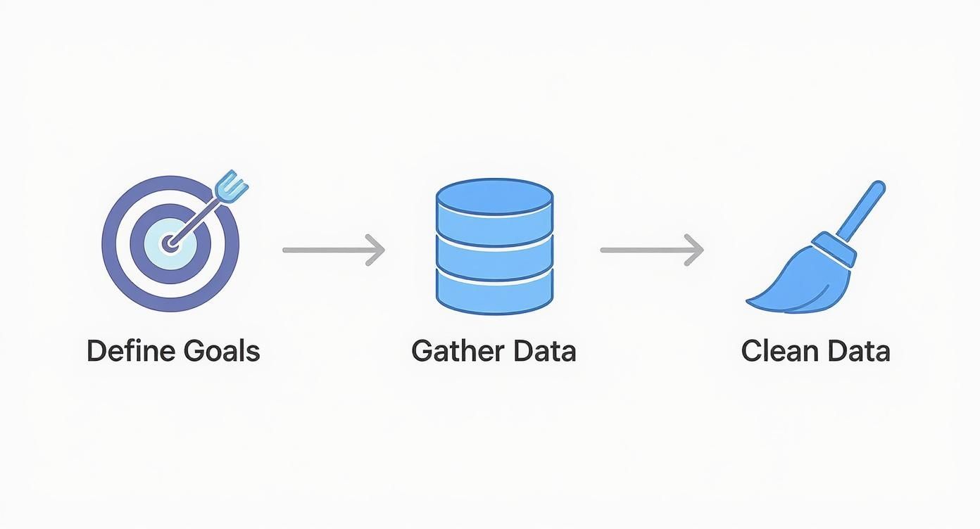
As you can see, defining your goals is the critical first step. Only then should you move on to gathering and cleaning the information.
Gather and Consolidate Your Data
With your objectives locked in, it’s time to round up the data. Your sales information is probably scattered across different systems—your POS, CRM software, e-commerce site, and maybe even marketing platforms. The goal here is to pull it all into one place.
This isn’t just a copy-paste job; it’s a strategic move. The use of data analytics in sales is exploding, with 93.9% of companies now investing in these tools, a jump from 87.8% just a couple of years ago. Why the rush? Because businesses that analyze their sales data in real time can spot hot leads faster, adjust pricing on the fly, and even see which customers might be about to leave. If you're curious, you can discover more insights about how data analytics is transforming sales performance.
The secret to successful data analysis isn't having the most data, but having the right data, properly cleaned and organized. An hour spent on data preparation can save ten hours of confusion during analysis.
Choosing Sales Metrics That Actually Matter

Alright, your data is clean and ready to go. Now for the hard part: what do you actually measure? It’s incredibly easy to drown in a sea of numbers, and focusing on the wrong metrics is a surefire way to waste time and energy. Think of it like trying to find your way with the wrong map—you'll be busy, but you won't get anywhere.
The real secret to a powerful analysis is to lock in on Key Performance Indicators (KPIs) that directly signal the health and growth of your business. These are the numbers that tell a story, helping you see what's working and what's falling flat.
Beyond Surface-Level Numbers
True insight doesn't come from vanity metrics like social media likes or website clicks. It comes from tracking numbers directly tied to your revenue, customer behavior, and how smoothly your operation runs.
Instead of getting distracted, you need to focus on the heavy hitters. I'm talking about metrics like:
- Customer Acquisition Cost (CAC): This tells you exactly how much you spend to land each new customer. It’s the ultimate report card for your marketing and sales budget.
- Customer Lifetime Value (CLV): CLV projects the total revenue you can expect from a single customer over time. This is a critical piece of the puzzle for understanding long-term profitability.
- Sales Cycle Length: How long does it take to convert a lead into a sale? A long cycle might mean there’s friction in your process that needs smoothing out.
- Average Deal Size: Knowing the typical value of a sale makes revenue forecasting far more accurate and helps you decide where to put your resources.
When you track KPIs like these, you move from just reporting on what happened to truly understanding why it happened—and what to do next. That's the difference between just looking at data and actually using it.
To get a clearer picture, it helps to see these metrics laid out and understand what story each one tells.
Essential Sales Metrics and What They Reveal
| Metric | What It Measures | Why It's Important |
|---|---|---|
| Customer Acquisition Cost (CAC) | The total cost of sales and marketing divided by the number of new customers acquired. | Evaluates the efficiency of your customer acquisition strategy. A high CAC can drain profitability. |
| Customer Lifetime Value (CLV) | The total revenue a business can expect from a single customer account throughout the relationship. | Helps you understand the long-term value of customers and informs decisions on retention spending. |
| Sales Cycle Length | The average amount of time from first contact with a lead to a closed deal. | Identifies bottlenecks in the sales funnel and helps forecast future revenue more accurately. |
| Average Deal Size | The average revenue generated from each closed deal. | Useful for sales forecasting, resource planning, and identifying upselling or cross-selling opportunities. |
Thinking about these metrics as a group gives you a much more complete view of your sales engine's performance. They work together to show where you're strong and where you need to improve.
Tailoring Metrics to Your Business Model
Here’s something a lot of people miss: the most important KPIs are not one-size-fits-all. What matters for a SaaS company is often irrelevant to a local restaurant. The goal is to build a balanced scorecard of metrics that gives you a complete view of your specific operation.
A common mistake is adopting generic KPIs without considering context. A retail store's success hinges on inventory turnover and foot traffic, while a SaaS business lives and dies by its monthly recurring revenue and churn rate. Choose metrics that reflect your unique path to profitability.
For example, a SaaS (Software as a Service) company will be obsessed with:
- Monthly Recurring Revenue (MRR): The lifeblood of any subscription business.
- Customer Churn Rate: The percentage of customers who cancel their subscriptions each month.
On the other hand, a brick-and-mortar retail business or restaurant will prioritize:
- Average Transaction Value (ATV): How much do customers typically spend in one visit?
- Inventory Turnover: How quickly are you selling through your stock?
- Sales per Square Foot: A classic measure of how efficiently you're using your physical space.
Picking the right metrics is the foundation of your entire analysis. For specific industries, like food service, digging into top restaurant analytics metrics can reveal incredible insights about menu performance and customer loyalty that generic KPIs would never show you.
Getting Your Hands Dirty: Practical Ways to Analyze Sales Data

Alright, your data is clean and you know which metrics matter. Now for the fun part—playing detective to uncover the stories hidden in your numbers. This is where you move past the spreadsheets and start applying specific techniques that turn raw data into a real strategic advantage.
Let's dive into the methods that will reveal what’s really going on in your business.
Uncover Patterns with Trend Analysis
Trend analysis is simply about looking for patterns in your sales data over time. It helps you find the natural rhythm of your business, letting you spot everything from seasonal peaks and promotional lifts to long-term growth curves. Once you can see these recurring patterns, making smart calls on inventory, staffing, and marketing becomes second nature.
For instance, a restaurant owner might notice that sales for a particular appetizer consistently spike every Friday night. This isn't just a random bit of trivia; it's a goldmine of an insight. They can now make sure they have enough ingredients on hand to meet that demand, or maybe even run a Friday-night special featuring that exact dish.
Trend analysis helps you shift from making reactive decisions to planning proactively. When you know that sales for your outdoor seating jump by 40% every May, you can build a confident spring marketing campaign instead of just crossing your fingers for good weather.
Understand Your Customers Through Segmentation
Let's be honest: not all customers are created equal. Segmentation analysis is how you group them based on shared characteristics. It’s a powerful way to figure out who your best customers are, what they buy, and what makes them tick. When you stop using a one-size-fits-all approach, your marketing efforts suddenly become a whole lot more effective.
You can slice and dice your audience in a few key ways:
- Demographics: Group customers by age, location, or gender. Do certain products resonate more with specific groups?
- Purchase Behavior: Separate the frequent, small-purchase customers from the ones who make infrequent but massive orders.
- Acquisition Channel: Compare the lifetime value of customers who found you on social media versus those who came from an email campaign.
Imagine an e-commerce brand that sells coffee beans. Through segmentation, they discover their most profitable customers are those who buy whole-bean, single-origin coffee every single month. This is huge. Now they can create a personalized loyalty program or run targeted ads aimed squarely at this high-value group to keep them coming back.
Optimize Your Process with Pipeline Analysis
Finally, pipeline analysis is all about looking at each stage of your sales process to see where deals are moving forward and where they’re stalling out. It shines a light on bottlenecks and shows you exactly where you’re losing potential customers.
Think about a B2B software company. They might analyze their sales pipeline and discover that while tons of prospects sign up for a demo, a huge percentage never actually start a trial. That's a massive red flag pointing to a problem between those two steps. Is the demo not compelling enough? Is the follow-up process too slow? By pinpointing this friction, the sales team can stop guessing and start fixing the real problem.
Using AI and Predictive Analytics to Get Ahead
Analyzing past performance is essential, but what if you could reliably predict what’s coming next? This is where the real competitive edge lies, and it’s powered by Artificial Intelligence (AI) and predictive analytics. We’re moving beyond just reviewing historical data and into the realm of forward-looking strategy.
These aren't just fancy buzzwords. AI-driven platforms can handle incredibly complex tasks that used to require a whole team of data scientists. Imagine a system that automatically identifies and scores your best leads, so your sales team knows exactly who to call first. This is happening right now, and it’s a game-changer.
Predicting Future Sales and Customer Behavior
At its heart, predictive analytics uses your historical data to forecast what's on the horizon. By digging through past sales and identifying subtle patterns most people would miss, AI models can project future revenue with remarkable accuracy. This insight is gold when you're making decisions about inventory, staffing, and where to put your marketing dollars.
It's not just about the numbers, either. These tools can anticipate what your customers might do next. For example, an AI could flag an account showing the early warning signs of churn, giving you the heads-up you need to step in and save the relationship. You get to be proactive instead of just reacting to problems.
The impact here is huge. Since 2025, over 80% of sales teams worldwide have brought AI into their data analysis workflow. In North America and Europe, that adoption rate jumps to over 90% for large companies. The proof is in the results: businesses using AI analytics are seeing their cost per lead drop by as much as 65% while growing their pipeline much faster.
Predictive analytics transforms your sales data from a historical record into a strategic map for the future. It's the difference between navigating by looking at your wake and steering by looking at the horizon.
Pinpointing Funnel Weaknesses with Precision
One of the most practical uses for AI is analyzing your sales pipeline. By looking at every single touchpoint a customer has with your business, the AI can show you exactly where your sales process is hitting a snag. Are people dropping off after the first demo? Or are your proposals not quite sealing the deal?
This kind of granular detail lets you make surgical fixes. Instead of guessing and overhauling your entire sales strategy, you can zero in on the specific weak points and strengthen them. It’s a principle that applies everywhere, from B2B sales to restaurants trying to optimize their customer flow. In fact, learning how restaurant data analytics tools maximize efficiency and profit can offer surprisingly relevant lessons for any business.
Of course, to make the most of these advanced tools, you need the right internal structure. A great next step is learning about building an AI Center of Excellence to ensure your organization has the foundation it needs to succeed.
Turning Data Into a Compelling Story

Let's be honest: a spreadsheet full of raw numbers won't persuade anyone to make a big decision. After you've done the hard work of cleaning, segmenting, and analyzing your sales data, the final and most crucial step is to turn it into a story that actually gets people to listen—and act.
This is all about data visualization. Your job is to transform those rows and columns into a clear, compelling narrative that guides your team from a business problem to a data-backed solution.
Choosing the Right Visuals for Your Data
Before you can tell a story, you need to pick the right tools to tell it with. The charts and graphs you choose are your vocabulary, and using the wrong one can completely muddle your message or lead to the wrong conclusions.
Think about what you're trying to show. A line chart is your go-to for tracking a trend over time, like seeing how your new coffee blend sold month-over-month. But if you want to compare sales across your different store locations, a bar chart is the clear winner.
An effective dashboard doesn't just throw data on a screen; it answers critical questions at a glance. Every chart should have a distinct purpose, contributing to the bigger picture of your business and pointing the viewer toward a specific insight.
Picking the right chart is half the battle. To help you decide, here’s a quick guide to matching your analysis goal with the best visualization.
Choosing the Right Chart for Your Sales Data
| Analysis Goal | Recommended Chart Type | Best Practice Tip |
|---|---|---|
| Tracking performance over time (e.g., monthly sales) | Line Chart | Keep it simple. Avoid plotting more than 3-4 lines on a single chart to prevent clutter and confusion. |
| Comparing values across categories (e.g., product sales) | Bar Chart | Always start the Y-axis at zero to provide an accurate, non-misleading comparison of the bars' lengths. |
| Showing parts of a whole (e.g., sales by payment method) | Pie Chart | Best used for 3-5 categories. If you have more, the slices become too small to interpret effectively. |
| Visualizing the relationship between two variables | Scatter Plot | Perfect for identifying correlations, like seeing if there's a link between customer visit frequency and average spend. |
| Displaying geographical data (e.g., sales by region) | Map Chart | Use a color gradient (e.g., light to dark) to represent value, making it easy to spot regional hotspots instantly. |
Once you have your visuals selected, you can start building a cohesive narrative around them.
From Charts to a Cohesive Narrative
Now it's time to connect the dots. Don't just show a bunch of charts and expect your audience to figure it out. You need to guide them through your findings with a clear beginning, middle, and end.
- Set the Stage: Start with the "why." What was the business question you were trying to answer? Maybe it was, "Why did our sales dip last quarter?" or "Which marketing campaign drove the most traffic?"
- Present the Evidence: This is the core of your story. Walk through your key findings, using each chart to support a specific point. Explain what the data is showing and—most importantly—why it matters to the business.
- Call to Action: End with the "so what?" Based on everything you've shown, what are the concrete, actionable next steps? This is where you turn insights into a plan.
This simple structure elevates your analysis from a boring report to a powerful tool for driving real change.
Making Your Story Stick
To make your insights truly hit home, connect them to concepts your audience already cares about. For instance, don't just say that Customer Lifetime Value (CLV) is up by 15%. Frame it in terms of what that means for your marketing budget and long-term revenue projections.
Building a solid narrative around key metrics like this is one of the smartest things you can do. If you're looking for more ways to do this, checking out some proven strategies to maximize customer lifetime value can give you some great ideas.
At the end of the day, the real measure of your success with data isn't the report you create, but the action it inspires. A great story, backed by clear visuals, gives you the power to present your findings with confidence and make a real impact on your business.
Tackling Common Questions in Sales Data Analysis
Even when you've got the right tools and a solid plan, you're bound to run into a few questions as you dig into your sales data. It happens to everyone. Getting ahead of these common hurdles can save you a ton of frustration and make sure your analysis actually leads somewhere useful.
Let's walk through some of the questions I hear most often.
What Are the Biggest Mistakes People Make?
I see a few common tripwires time and time again.
First and foremost is working with unclean or incomplete data. This is, without a doubt, the number one reason an analysis goes off the rails. If your data is a mess—full of duplicates, missing fields, or typos—your conclusions will be just as messy. It’s like trying to navigate with a map that has half the roads missing.
Another big one is getting distracted by vanity metrics. It's easy to get excited about big numbers, like a spike in website traffic. But if those visitors aren't buying anything, that traffic isn't helping your bottom line. You have to connect every metric you track back to a real business goal, like revenue or customer retention.
Finally, you have to actively fight against confirmation bias. We all have a natural tendency to look for data that proves what we already think is true. To get an honest look at your business, you have to be willing to let the numbers surprise you, even if they tell you something you don't want to hear.
The best way to sidestep these problems? Start with a thorough data cleaning process—don't skip it. Define your goals and the KPIs that actually matter before you even look at a chart. And build a culture where objective data is more important than anyone's gut feeling.
How Often Should I Be Looking at My Sales Data?
This is a great question, and the honest answer is: it depends. The right rhythm for analyzing your data is all about your business cycle and what you're trying to learn.
There’s no magic number, but here’s a good rule of thumb I use:
- Big-picture strategic metrics, like quarterly revenue growth or customer lifetime value, are best reviewed monthly or quarterly. You need a bit of time to see real movement here.
- Day-to-day operational metrics, like lead conversion rates or daily store sales, need a much closer eye. I'd recommend tracking these weekly, or even daily, using a live dashboard.
The goal is to create a consistent routine. For your major strategic planning, block off time for a deep-dive analysis every quarter or twice a year. This gives you enough data to spot meaningful long-term trends and make confident decisions for the months ahead.
What Tools Should a Beginner Start With?
You don't need to spend a fortune on fancy software to get started. In fact, you probably already have access to some incredibly powerful tools.
Spreadsheets like Microsoft Excel or Google Sheets are the perfect place to begin. Don't underestimate them! Features like pivot tables, charts, and basic formulas are more than enough to handle serious analysis, and they're a great way to learn the fundamentals without a steep learning curve.
Once you feel comfortable and your needs get more complex, you can look at more specialized tools. Many modern CRMs and POS systems now come with fantastic built-in analytics dashboards that are surprisingly easy to use. They can give you powerful insights without needing a data science degree.
Ready to stop guessing and start knowing? The advanced analytics and reporting features in Biyo POS turn your raw sales numbers into clear, actionable insights. Track your top-performing products, understand customer behavior, and make data-backed decisions that drive growth. Start your 14-day free trial today and see what your data can really do for you.