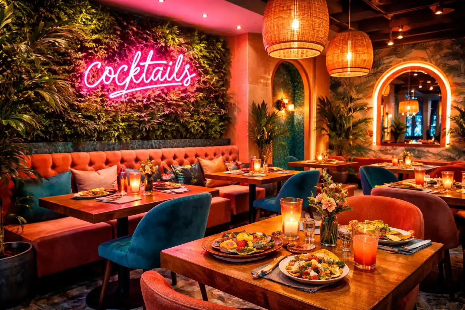
The first impression of a restaurant begins long before guests sit down at a table. The restaurant entryway color scheme and branding serve as a silent ambassador, telling visitors what to expect inside. From the color of the door and signage to the lighting and décor, every element contributes to your brand identity. When designed well, the entryway becomes more than just a passage—it turns into a storytelling medium that communicates personality, professionalism, and hospitality. In an era where customers often choose dining spots based on visual appeal alone, creating an inviting entryway is not just an option; it’s a competitive necessity.
Table of Contents
- Defining Brand Identity Through Entryway Colors
- The Role of Color Psychology in Restaurant Branding
- Design Harmony and Cohesive Branding
- Impact on Customer Perception and Experience
- Practical Tips for Entryway Branding Success
- Frequently Asked Questions
Defining Brand Identity Through Entryway Colors
When customers approach your restaurant, the entryway becomes their first interaction with your brand identity. This means that the restaurant entryway color scheme and branding need to be deliberate and intentional, aligning with the values, mood, and experience your business represents. Whether your restaurant is known for elegance, comfort, or adventurous cuisine, the entryway colors and design elements should serve as an immediate reflection of that identity.
The Psychology of Restaurant Colors
Colors act as a visual language, and when chosen carefully, they translate your restaurant’s brand identity into something tangible that customers immediately recognize. For instance, an upscale sushi bar might use minimalistic tones such as black, white, and deep gray to emphasize refinement, while a family-friendly diner may lean on bright and inviting colors like cheerful yellows and sky blues to convey warmth and approachability. The chosen palette should never be random; it should be guided by a deep understanding of who your target audience is and what emotions you want to evoke in them. Research shows that people make subconscious judgments about an environment within seconds of seeing it, and entryway colors play a major role in those impressions. By ensuring your palette matches your concept, you send a strong signal that your restaurant understands and values its audience.
Consistency is Key
Consistency between your logo, menus, and physical entryway design also enhances brand recognition. If your restaurant’s branding relies heavily on a certain shade—say, a deep burgundy in your logo—then weaving this into the door paint, awning, or even subtle accent lighting makes the brand identity more memorable. A mismatch, on the other hand, creates confusion. Imagine encountering a restaurant with a sleek black-and-gold logo online, only to find its entryway painted in pastel colors. The inconsistency leaves potential customers questioning the authenticity and attention to detail of the business. Therefore, aligning colors with your brand identity is not just an artistic choice; it is a business decision that directly affects how customers perceive your credibility.
Establishing Brand Guidelines
Restaurants that succeed in this area often document their brand identity guidelines, ensuring that any future renovations or seasonal updates do not veer off-brand. These guidelines may include Pantone codes for colors, font choices for signage, and mood boards for overall design direction. By doing this, the restaurant ensures that every detail from the entryway to the dining area contributes to a cohesive branding experience, ultimately reinforcing long-term loyalty and recognition.
Exterior Design as a Branding Tool
Beyond color selection, the broader exterior design plays a critical role in how the entryway communicates brand identity. Exterior design involves the architecture, textures, materials, and accents used to frame the color scheme. For example, a rustic steakhouse may incorporate natural stone walls, heavy wooden beams, and wrought-iron light fixtures, which together reinforce the rugged and traditional brand identity. A vegan café, on the other hand, might emphasize eco-friendly materials, reclaimed wood, and lush greenery at the entrance, signaling sustainability and wellness as core values. These design elements serve as powerful non-verbal cues, telling guests exactly what kind of dining experience they are about to enjoy.
Exterior design also affects practical branding considerations like visibility and differentiation. In competitive restaurant districts, where businesses line the streets shoulder to shoulder, your entryway needs to stand out without appearing out of place. Bold signage colors, unique textures, and distinctive architectural elements can capture attention while still remaining consistent with your brand’s visual identity. For example, a neon sign in signature brand colors can draw eyes from afar, while a custom-designed door can become a conversation piece that customers remember long after their visit.
In addition, exterior design should account for durability and seasonal adaptability. The best entryways maintain their aesthetic consistency year-round, whether under the summer sun or holiday decorations. Materials should be chosen not only for their beauty but also for their ability to age gracefully while preserving brand identity. A thoughtful combination of colors and design elements ensures that your restaurant’s entryway remains an effective branding tool over time, adapting without losing its essence.
Logo Integration and Visual Identity
Your restaurant’s logo is the cornerstone of your visual identity, and its integration into the entryway is essential for reinforcing branding. A well-placed logo on signage, doors, or even window decals ties the entire design together. For instance, a logo etched onto glass doors paired with complementary signage colors creates a seamless experience that strengthens recognition. Customers are more likely to remember your restaurant when the logo is consistently and creatively presented in conjunction with the entryway color scheme. This connection between color and logo integration enhances visual identity while also boosting brand recall in the minds of potential guests.
Lighting can further emphasize your logo’s role in branding. For restaurants that operate late into the night, illuminated signage ensures the brand is visible and memorable even in low-light conditions. Consider the impact of a softly glowing logo positioned at eye level—it not only highlights the restaurant’s name but also makes the space feel inviting. In contrast, a dimly lit or poorly placed logo risks going unnoticed, costing the restaurant valuable recognition opportunities. Integrating lighting with the logo creates a sense of sophistication and attention to detail that customers appreciate.
Finally, strong logo integration ensures consistency across digital and physical touchpoints. When customers see your logo on social media, menus, and promotional campaigns, they should instantly recall the physical branding they experienced at the entryway. This aesthetic consistency builds trust and strengthens customer loyalty. In the competitive restaurant industry, where new establishments open constantly, brand recognition through consistent logo and color integration provides a critical advantage. By ensuring that the entryway reflects the same visual identity as the rest of your brand, you create a powerful sense of familiarity and professionalism that resonates with guests.

The Role of Color Psychology in Restaurant Branding
Color psychology is one of the most influential yet often overlooked factors in creating a strong restaurant entryway color scheme and branding. Colors evoke specific emotions, trigger memories, and shape customer behavior without the need for words. When potential diners approach your restaurant, their brains instantly begin processing the color signals from your entryway, forming assumptions about the type of food, service, and atmosphere they can expect inside. Understanding how different colors influence perception allows restaurants to carefully craft a brand message that resonates deeply with their target audience.
Inviting Colors and Warm Tones
Warm tones such as reds, oranges, and yellows are often used in the food and hospitality industry because of their ability to stimulate appetite and evoke feelings of warmth. Studies in environmental psychology suggest that red can increase energy levels and excitement, making it a popular choice for casual restaurants and fast-food chains. A Mexican taqueria, for instance, might incorporate bright red doors or terracotta-colored tiles at the entryway to signal a lively, vibrant dining experience. On the other hand, golden or amber lighting paired with earthy orange hues creates a cozier atmosphere suited for family-style dining. These warm tones encourage customers to feel comfortable and welcome, which increases the likelihood of repeat visits.
However, balance is critical when using warm tones. An entryway dominated entirely by bold red can feel overwhelming or even aggressive, potentially deterring some customers. To avoid this, many restaurants pair warm tones with softer neutrals like beige, tan, or light wood finishes. For example, a pizzeria might use rustic red brick walls at the entrance complemented by natural wooden signage. This creates an inviting balance that communicates authenticity without overwhelming the senses. Thoughtful layering of warm tones ensures they work in harmony with the rest of the design, highlighting hospitality and approachability.
Restaurants can also use inviting colors seasonally to maintain freshness and relevance. For instance, a café may decorate its entryway with warm-toned floral arrangements in the summer or use deep burgundy and burnt orange during the fall. These seasonal updates help the entryway remain visually appealing while maintaining a cohesive connection to the core color palette. By thoughtfully incorporating warm tones, restaurants can strike the perfect balance between comfort and vibrancy, ensuring that guests feel drawn in from the very first glance.
Modern Palettes and Neutral Shades
Neutral shades such as black, white, gray, and beige form the backbone of many modern restaurant branding strategies. These palettes convey elegance, timelessness, and versatility, making them especially effective for upscale establishments and contemporary dining spaces. A minimalist sushi restaurant, for instance, may use a white façade with sleek black signage to create a clean, refined look that signals sophistication. These modern palettes help restaurants communicate professionalism and exclusivity, which attracts customers seeking high-quality dining experiences.
Neutral shades are also highly adaptable, serving as perfect canvases for bold accent colors or creative design features. For example, a charcoal-gray exterior might be paired with striking gold lettering, immediately communicating a sense of luxury. Similarly, a beige-toned entryway could incorporate green plants and subtle wooden textures to add warmth while maintaining a modern aesthetic. This balance ensures that neutral palettes never appear bland but instead create a polished foundation that amplifies other branding elements.
Another benefit of neutral shades is their long-term sustainability. While trendy colors may go out of fashion, neutral tones remain timeless, reducing the need for frequent redesigns. This makes them cost-effective for restaurants investing in a strong long-term brand identity. Moreover, neutral shades photograph well, ensuring that images of your restaurant’s entryway look consistent across marketing materials, websites, and social media. By choosing a modern palette grounded in neutral shades, restaurants can position themselves as timeless, reliable, and visually appealing to a wide audience.
Bold Accents and Seasonal Colors
While core palettes define a restaurant’s identity, bold accents add personality and memorability. Accents in vibrant shades such as teal, crimson, or mustard can transform an otherwise understated entryway into a landmark that stands out in a busy neighborhood. For example, a bakery might use a bright yellow awning against a white storefront, making the entrance instantly recognizable and cheerful. These pops of color serve as visual hooks, encouraging customers to stop and explore further. Bold accents should be used strategically, complementing the main palette rather than overpowering it, to achieve the perfect balance of creativity and cohesion.
Seasonal colors provide another opportunity to keep the entryway design fresh and engaging. Restaurants that adapt their décor for holidays and seasons demonstrate attentiveness to detail and customer experience. For instance, a restaurant might incorporate red and green accents in its entryway during winter holidays or pastel tones in the spring. These subtle changes not only enhance curb appeal but also communicate that the restaurant is dynamic, festive, and connected to its community. Seasonal updates can be as simple as changing floral arrangements, signage lighting, or window displays to reflect timely color schemes.
Combining bold accents with seasonal flexibility creates an entryway design that feels alive and relevant year-round. A base palette ensures aesthetic consistency, while accent colors and seasonal updates introduce variety and excitement. This dual approach ensures that the restaurant’s entryway remains an engaging and memorable element of branding, strengthening customer loyalty and keeping the establishment visually competitive in changing market landscapes.
Design Harmony and Cohesive Branding
The effectiveness of a restaurant entryway color scheme and branding does not depend solely on color choices. True success comes from design harmony, where every detail—colors, lighting, textures, and signage—work together seamlessly to create a cohesive customer experience. Without this harmony, even the best color palette can feel disjointed. Cohesive branding creates a sense of professionalism and consistency that assures guests they are entering a well-curated environment.
Signage Colors and Brand Recognition
Signage serves as the anchor of a restaurant’s entryway branding. A sign is often the first element people notice, especially in busy districts or from a distance. When signage colors align with the overall palette, they reinforce brand recognition and help customers quickly identify the restaurant. For example, a seafood restaurant with a nautical theme might use navy and white signage with anchor motifs, perfectly complementing an ocean-inspired entryway design. This consistency creates instant recognition and positions the brand as credible and intentional.
Misaligned signage colors, on the other hand, can create confusion. Imagine a modern fine-dining establishment that uses a minimalist black-and-gold palette for its entryway but displays a bright neon-green sign. The disconnect not only undermines aesthetic consistency but also sends mixed signals about the dining experience inside. To avoid this, signage should always reinforce, rather than contradict, the overall color scheme. Cohesive signage colors make branding more memorable and help customers associate positive emotions with your restaurant’s visual identity.
In addition, signage plays a role in repeat recognition. When customers pass by your restaurant multiple times, consistent signage colors and design help create mental associations. Over time, this familiarity builds loyalty, as customers come to trust that the brand consistently delivers on its promises. Signage colors, when integrated effectively, become more than just decoration—they become a key driver of long-term brand recognition and success.
Aesthetic Consistency Across Décor
Aesthetic consistency means that every detail in the entryway works together harmoniously. This includes not only colors but also materials, textures, and supporting décor. For example, a Mediterranean restaurant might pair whitewashed walls with cobalt-blue planters and terracotta tiles, echoing the coastal ambiance associated with the region. These repeated themes build a stronger brand identity and reassure customers that the restaurant has invested in creating an authentic and immersive experience. Without aesthetic consistency, an entryway can feel chaotic or incomplete, reducing the impact of even the best-designed color scheme.
Maintaining consistency also helps bridge the gap between exterior and interior design. Customers expect the entryway to serve as a preview of what awaits inside. If the entryway suggests rustic charm but the interior is sleek and futuristic, the inconsistency may lead to disappointment or confusion. On the other hand, when colors, textures, and themes align across both spaces, the transition feels seamless and satisfying. Customers value this level of attention to detail, interpreting it as a sign of professionalism and quality service.
Aesthetic consistency also aids in marketing and online branding. Photos of your entryway that align with interior shots posted on social media or websites create a cohesive digital footprint. This unified branding reassures potential customers scrolling online that the restaurant delivers a reliable and authentic experience, ultimately strengthening trust before they ever step inside.
Ambient Lighting and Design Harmony
Lighting has a profound effect on how customers perceive your entryway colors and branding. During the day, natural light highlights textures and tones, while at night, artificial lighting becomes the main tool for shaping the atmosphere. Restaurants that invest in strategic lighting can enhance their entryway’s appeal and ensure design harmony across all hours of operation. Warm ambient lighting, for example, accentuates inviting tones like oranges and browns, while cool lighting emphasizes modern palettes of silver, gray, or blue. By matching the lighting to the chosen color scheme, restaurants create a consistent and immersive branding experience.
Lighting also highlights focal points, such as signage or logos, making them more noticeable and memorable. Spotlights on your restaurant name, lanterns framing the entrance, or LED strips under architectural details draw attention to branding elements that might otherwise go unnoticed. Customers interpret well-lit spaces as safe, professional, and welcoming, while poorly lit entryways can feel uninviting and deter potential guests. Proper lighting design is therefore not just an aesthetic choice but also a practical necessity for customer attraction.
Finally, lighting contributes to the emotional impact of the entryway. A softly lit doorway can evoke romance and intimacy, ideal for fine dining, while bright, playful lighting can suggest energy and fun, perfect for a bar or casual eatery. By harmonizing ambient lighting with the overall design, restaurants can ensure that every detail—color, signage, décor, and atmosphere—comes together in a unified expression of brand identity. This design harmony creates lasting impressions that encourage guests to return and recommend your restaurant to others.
Impact on Customer Perception and Experience
The restaurant entryway color scheme and branding are not just visual elements; they actively shape how customers perceive your restaurant before they even walk through the door. From emotional reactions to expectations about service quality, the design of your entryway has a powerful influence on the customer journey. In fact, research in hospitality branding design consistently shows that first impressions directly impact whether guests decide to enter, recommend, or return to a restaurant. A well-executed entryway design, therefore, is not only an aesthetic investment but also a strategic business decision.
Customer Perception and Emotional Response
Every color and design choice in your entryway sparks an emotional response in potential diners. For example, warm tones at the entrance may evoke feelings of comfort and belonging, while a sleek, neutral palette suggests sophistication and exclusivity. These initial emotional cues shape how customers expect to feel during their visit. If the entryway communicates vibrancy and energy, guests will anticipate a lively dining experience. If it communicates elegance, they will expect attentive service and fine details. This means that the psychological impact of your entryway colors goes far beyond aesthetics—it sets the emotional stage for the entire meal.
Emotional responses also influence decision-making. Diners who feel relaxed and welcome at your entryway are more likely to enter, even if they hadn’t originally planned to stop in. Conversely, a dull or poorly designed entrance can deter potential guests, regardless of how exceptional the food may be inside. This demonstrates the importance of investing in a design that creates positive emotional responses aligned with your brand identity. When customers feel understood and comfortable at first sight, they are more inclined to give your restaurant their trust and loyalty.
Restaurants that excel in emotional branding often use their entryways as storytelling spaces. For instance, a farm-to-table restaurant might feature greenery, rustic signage, and earthy tones to evoke freshness and sustainability. These design choices not only please the eye but also connect emotionally with diners who value natural, organic dining experiences. By designing with emotion in mind, restaurants can create deeper connections that resonate long after the meal is over.
Curb Appeal and First Impressions
Curb appeal is the magnet that pulls in foot traffic, and your entryway is at the center of that appeal. In competitive areas where multiple restaurants line the same street, a visually appealing and cohesive entryway can be the deciding factor in why a customer chooses your restaurant over another. Elements such as clean signage, consistent color palettes, seasonal décor, and ambient lighting all contribute to building strong curb appeal. This is especially important in hospitality branding design, where the exterior sets customer expectations about the quality of service and food inside.
First impressions formed by curb appeal are remarkably difficult to change. A restaurant with chipped paint, faded signage, or mismatched entryway décor risks signaling neglect or inconsistency. Customers may assume that the same lack of care will extend to the food and service, even if that’s not the case. On the other hand, a well-maintained, visually consistent entryway signals professionalism and pride in your establishment. Customers who encounter a clean, attractive, and on-brand exterior are more likely to view the restaurant as reliable and trustworthy.
Curb appeal also has a measurable impact on marketing. Photos of aesthetically pleasing entryways often circulate on social media, providing organic exposure. Restaurants with unique or iconic entryways often become Instagram-worthy destinations, with customers eager to share their experience online. This digital visibility adds another layer to brand recognition, extending the power of curb appeal beyond the immediate neighborhood and into broader markets.
Visual Identity and Hospitality Branding
Visual identity is the foundation of hospitality branding, and the entryway is its stage. By aligning signage, color schemes, décor, and lighting, restaurants can create a clear and memorable visual identity that strengthens brand recognition. Customers often associate strong visual identity with professionalism and reliability, interpreting it as a reflection of the dining experience inside. This makes your entryway more than just a physical space—it becomes a critical part of your restaurant’s marketing strategy.
Consistency between your entryway and other brand touchpoints, such as your website, menus, and social media, is equally important. When customers see the same colors, fonts, and styles across both digital and physical platforms, they feel reassured that your brand is cohesive and intentional. This aesthetic consistency enhances trust, as customers come to expect the same level of care and quality in every interaction with your brand. In a marketplace where competition is fierce, this consistency can make the difference between winning or losing a potential diner.
Restaurants with strong visual identity also enjoy higher brand recognition over time. For example, think of iconic chains whose entryways are instantly recognizable because of consistent branding choices—whether it’s a golden arch, a specific color combination, or a unique architectural feature. While independent restaurants may not have global recognition, they can still use visual identity strategies to dominate their local market. By crafting an entryway that embodies your restaurant’s personality, you create an unforgettable brand impression that resonates with both new and returning guests.
Practical Tips for Entryway Branding Success
Designing an effective restaurant entryway color scheme and branding doesn’t require guesswork—it requires strategy. By following practical guidelines, restaurant owners can ensure that their entryways not only look appealing but also strengthen brand identity and customer loyalty. From choosing the right palette to maintaining design harmony over time, each decision shapes how customers perceive your establishment. The following strategies provide actionable steps for creating entryway branding that supports long-term success.
Choosing the Right Palette
Selecting the right palette is the cornerstone of successful entryway branding. The palette should reflect both your brand identity and the emotions you want to evoke in customers. For example, a modern fine-dining restaurant might choose monochromatic tones like black and silver to convey elegance, while a family-owned Italian eatery might rely on warm reds and earthy greens to emphasize comfort and tradition. Your palette should not only represent your cuisine and concept but also appeal to your target audience’s preferences and expectations. A mismatch between your palette and your brand message risks confusing or alienating customers.
To ensure accuracy, many restaurants use color psychology research when developing palettes. Studies indicate that blue can suggest calmness and trust, red can stimulate appetite, and green can convey freshness. By aligning these associations with your restaurant’s brand identity, you can choose colors that amplify your message. For instance, a seafood restaurant might use shades of blue and turquoise to signal ocean freshness, while a farm-to-table concept may focus on green and brown tones to reflect natural authenticity. The right palette creates a seamless connection between your values and customer perceptions.
Once chosen, the palette should remain consistent across signage, décor, and promotional materials. Documenting the exact color codes in brand guidelines ensures that future updates or redesigns remain faithful to the original brand identity. This consistency strengthens recognition and builds long-term trust with customers who come to associate your restaurant with its signature look.
Maintaining Aesthetic Consistency
Aesthetic consistency ensures that every design element in your entryway supports your overall brand identity. This means that your signage, lighting, wall colors, and décor must all work together rather than competing for attention. Inconsistent design choices—such as pairing a rustic wooden door with neon signage—confuse customers and weaken brand messaging. To prevent this, many successful restaurants create design guidelines that outline approved color palettes, décor styles, and font usage. These guidelines help maintain consistency, even when multiple people or vendors are involved in the design process.
Consistency also extends to the transition from the exterior to the interior. Guests should experience a seamless flow of branding as they move from the entryway into the dining room. A rustic, cozy entryway should lead into an equally warm and welcoming interior, while a sleek, minimalist entrance should open into a refined, contemporary space. This alignment reassures customers that the restaurant is intentional and trustworthy. Any disconnect between exterior and interior aesthetics risks creating disappointment, which may negatively impact customer satisfaction and retention.
Maintaining consistency also pays off in marketing efforts. When entryway photos align with images of the interior, menu, and overall branding, they create a cohesive presence across digital platforms. This strengthens recognition online and offline, ensuring that customers always associate your restaurant with professionalism and care. Aesthetic consistency, therefore, is not just about design—it is about creating a unified brand experience that extends across all customer touchpoints.
Enhancing Design Harmony Over Time
Restaurant branding is not static—it evolves with trends, seasons, and customer expectations. For this reason, maintaining and enhancing design harmony over time is essential. Regular maintenance, such as repainting faded walls, updating lighting fixtures, or refreshing outdoor décor, prevents your entryway from appearing neglected. Small updates can go a long way in preserving brand appeal without requiring a complete overhaul. For example, changing the color of planters to match seasonal themes or adding updated signage can keep the entryway looking current while still consistent with the core palette.
Restaurants should also periodically evaluate their branding to ensure it remains relevant. Market trends change, and customer expectations evolve. While timeless palettes remain effective, subtle updates in design details can signal that your restaurant is modern and forward-thinking. For instance, a restaurant with a classic black-and-white entryway may add digital menu displays or updated lighting to modernize the look without compromising brand identity. These enhancements keep the design engaging while preserving core brand elements.
Finally, enhancing design harmony involves balancing tradition with innovation. Restaurants with long-standing brand recognition must carefully integrate updates so as not to alienate loyal customers. Introducing modern elements gradually—such as energy-efficient lighting or seasonal accent colors—ensures that the brand feels fresh while still recognizable. By continually investing in design harmony, restaurants can sustain their relevance and appeal in an ever-changing market, securing long-term customer loyalty.

Why Biyo POS Supports Your Branding Success
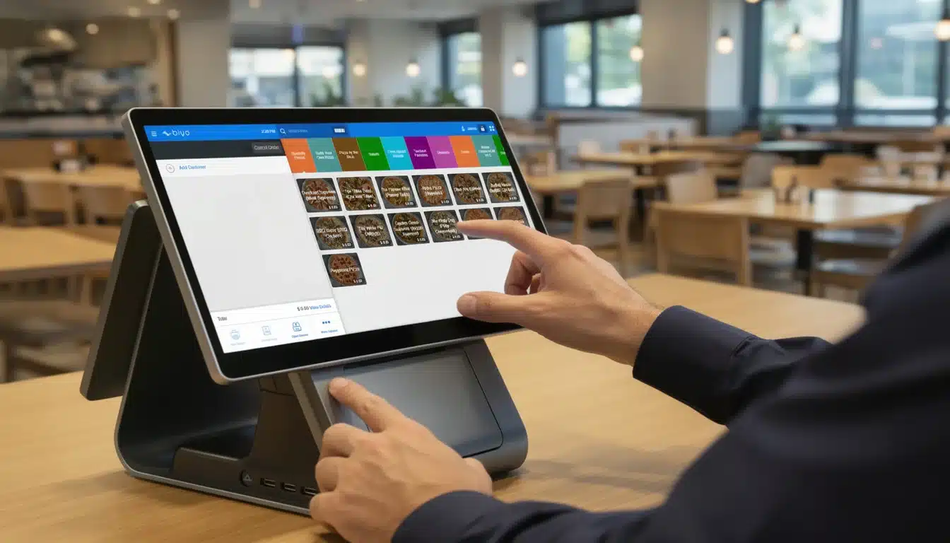
A well-designed restaurant entryway color scheme and branding draws customers in, but what keeps them loyal is the experience inside. Biyo POS ensures that your brand promise extends beyond the entrance by delivering seamless, technology-driven service solutions. With AI-powered phone ordering, smart menu synchronization, and real-time analytics, Biyo POS allows you to create consistent branding across every customer interaction. Just as your entryway signals professionalism and care, Biyo POS ensures that every order, payment, and guest interaction reflects the same level of quality. By aligning operations with your branding, Biyo POS helps restaurants strengthen their reputation and grow sustainably in competitive markets.
Frequently Asked Questions
Why is the restaurant entryway color scheme and branding so important?
The entryway is the first impression customers get of your restaurant. A cohesive color scheme and branding strategy set expectations, build trust, and increase curb appeal. Customers often decide whether to enter based on these first impressions, making entryway design a critical factor for success.
How does color psychology influence restaurant branding?
Color psychology shapes emotional responses and customer behavior. Warm tones create comfort and stimulate appetite, neutral palettes convey sophistication, and bold accents capture attention. By aligning your entryway colors with your brand identity, you influence customer perceptions before they even walk inside.
What are some practical tips for maintaining cohesive branding?
Document your brand guidelines to ensure consistency in colors, signage, and décor. Regularly maintain and refresh your entryway to avoid signs of neglect. Balance timeless design with seasonal updates to stay relevant, and ensure that your entryway reflects the same aesthetic identity as your interior and marketing materials.